- Marketing, Sales
Why Beautiful Packaging Doesn’t Sell (And Ugly Packaging Sometimes Does)
By:

Sponsored by: Avidity Creative, they help food and beverage brands bring strategy and shelf appeal together. You can visit aviditycreative.com or connect directly if you’d like some feedback on your current packaging.
You’ve spent months perfecting your product. You’ve worked with a designer to create a logo that makes your heart flutter. You finally get the packaging in hand, take some moody photos for Instagram, and wait for the sales to roll in.
But they don’t.
Instead, you’re watching your beautiful brand sit quietly on the shelf while a clunky, low-budget-looking competitor flies off it. What gives?
Here’s the hard truth: beautiful packaging doesn’t guarantee sales. In fact, some of the most successful products in the grocery aisle have packaging that would never make it onto a design blog. And sometimes, “ugly” packaging wins, because it actually does the job better.
Let’s dig into why that happens, and what founders need to focus on instead.
Founders Love Pretty Things (And That’s Okay)
It makes total sense: you’ve poured your heart into your brand. You want the packaging to reflect that love and care. You want it to impress your friends, your investors, your fellow founders. Maybe even a judge or two from a design competition.
But here’s the thing: shoppers don’t shop like that.
Your average consumer isn’t analyzing your color palette or admiring your font choice. They’re standing in front of a cluttered shelf, distracted, time-crunched, and trying to make a quick decision. They’re not looking for art. They’re looking for clues.
If your packaging looks good but doesn’t help them make a decision, it’s failing.
9 Reasons “Ugly” Packaging Sometimes Outsells the Pretty Stuff
Here’s why some designs that look like they haven’t been updated since 1997 are still winning at retail:
1. The product solves a real problem.
No one’s buying bland crackers with gorgeous packaging more than once. A good product can survive mediocre packaging—but not the other way around.
2. Customers are cult-level loyal.
If people love your product, they’ll keep buying it, even if it’s wrapped in a potato sack. Take Dots Pretzels: their original packaging wasn’t exactly “designed,” but it didn’t matter. People were hooked.

3. It’s attention-grabbing without being trendy.
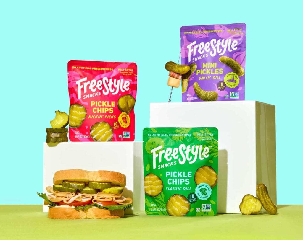
Busy, bright, or even downright weird packaging can stand out in a sea of minimalist sameness. Pirate’s Booty doesn’t win style awards, but its cheesy pirate and bold fonts make it hard to miss on the shelf.

4. It communicates clearly.
Ugly but clear will always beat pretty but confusing. Shoppers need to know what it is, why it matters, and what makes it different—fast.
5. It’s cheaper and that’s what matters.
Some shoppers are simply hunting for the best deal. If your product is the value option, flashy design might actually feel off-brand.
6. It feels familiar.
Nostalgia is a powerful driver. One of my personal favorites is Twin Bing from Palmer’s Candy. The packaging hasn’t changed much in decades, and I’d eat it no matter what it looked like. There are definitely improvements they could make but I’d never recommend a drastic redesign.

7. It dominates a niche.
When a product has little competition or owns a niche, the packaging doesn’t need to work as hard. It just needs to show up and be recognized. La Croix was one of the first in its category and even became a bit of a meme with its ultra subtle flavors. This led to a dominating presence.

8. It stands out on the shelf.
Sometimes what makes packaging “ugly” is exactly what helps it catch the eye like bold colors, strange fonts, or crowded layouts can cut through the noise if everyone else is playing it safe.
9. Marketing and distribution are doing the heavy lifting.
If a brand has great placement, sampling campaigns, or in-store promos, that can make up for what the design lacks. Packaging doesn’t live in a vacuum, it’s part of a bigger system.
So What Should Your Packaging Be Doing?
Let’s be clear: design still matters. But it’s not just about looking good, it’s about working hard.
Your packaging should:
- Grab attention
- Communicate clearly
- Reinforce your positioning
- Make the purchase feel like the right decision
If your packaging doesn’t do those things, it doesn’t matter how pretty it is. It’s not doing its job.
Pretty ≠ Effective
Designers and founders sometimes forget this: effectiveness and attractiveness aren’t the same thing.
Take another look around your local grocery store. Some of the best-selling products aren’t visually impressive; they’re just right for the category. They feel familiar, easy to grab, easy to understand. They weren’t designed to win awards, they were designed to move units.
And that’s the goal.
What This Means for Early-Stage Brands
If you’re still in the early stages, here’s your permission slip: you don’t have to get everything perfect right now.
Yes, design matters. But don’t confuse “pretty” with “powerful.” Your packaging doesn’t need to look like a direct-to-consumer darling; it needs to resonate with your target audience in the context of a physical store.
Focus on:
- Clarity over cleverness
- Shelf impact over subtlety
- Communication over decoration
Test with real people. Stand your packaging next to competitors. Ask shoppers what they think it is and why they would (or wouldn’t) grab it.
Because in the real world, your design isn’t judged on a screen, it’s judged in three seconds, at arm’s length, under fluorescent lighting.
One Last Thought
Great packaging isn’t always the prettiest, it’s the most functional. It gets picked up, it gets bought, and it gets remembered. If it happens to look beautiful while doing that? Bonus.
But don’t lose sleep trying to make it “perfect.” Make it work.
Need Packaging Advice?
If you’re unsure whether your packaging is working as hard as it could be, feel free to reach out. At Avidity Creative, we help food and beverage brands bring strategy and shelf appeal together. You can visit aviditycreative.com or connect directly if you’d like some feedback on your current packaging.
Education Articles