
- Marketing, Operations
The Creative Side of Compliance
By:
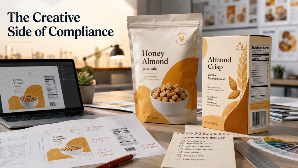
If you’ve been in CPG long enough, you know the feeling…
You’ve gone through round after round of revisions and finally love the package design. The colors pop, the hierarchy is balanced and the product photography looks delicious. You can practically see it sitting on shelf already.
Then the regulatory comments arrive.
Suddenly:
- “Flavored” or “Style” has to be added to the product name
- the Nutrition Facts panel at legal size eats half the package
- type sizes need to double and the entire layout falls apart
Panic sets in and compliance starts to feel like it’s going to ruin your best laid plans. But in reality, compliance is not the enemy of branding. It’s simply another design constraint, like budget, shelf size, printing limitations, or material selection. And just like those constraints, it’s most efficient to account for it early.
The hidden costs of late-stage compliance
When compliance gets pushed to the end of the project, the fallout can be expensive:
- costly revisions
- delayed launch timelines
- last-minute design compromises
- additional print rounds
- retailer issues
- stressed-out founders wondering why nobody mentioned this earlier
How to avoid common compliance pitfalls:
Treating compliance reviews as the final 11th-hour step in the design process often turns preventable issues into major setbacks. Integrating 1–2 earlier compliance reviews into your process may add a couple weeks to your timeline upfront, but typically saves significant time, money, and frustration later.
At Truly, we use what we like to call “Zen Compliance,” bringing regulatory reviews in at three key checkpoints throughout the design process.
1. Before design starts:
Before starting design, confirm foundational details like the statement of identity (the legal product name that appears on packaging), product descriptions, and any claims you’d like to feature. Many claims require additional qualifiers, such as adding “per serving” to a protein callout, and it’s far easier to design with those requirements in mind from the beginning. It’s also important to determine whether the product falls under FDA or USDA oversight, since each agency has different labeling requirements.
2. Before extending the selected design:
As soon as you have a clear design direction, send the first 1–2 SKUs out for a compliance review. Early feedback can usually be applied across the rest of the product line, saving significant revisions later. At this stage, photography is often still placeholder imagery, which is ideal because layouts are much easier to adjust before final photography is locked in. Even if only the front panel is ready, an early review can reveal issues that significantly affect the layout, such as non-compliant font sizes.
3. Before printing:
Before going to print, all sides of every SKU should undergo a final compliance review. A few issues may still arise, but if the earlier reviews were completed properly, they should be far less significant and much easier to address.
Consider this final review mandatory insurance against recalls, retailer issues, and costly reprints.
When compliance feedback arrives, don’t panic
Getting regulatory comments back can feel a little like getting a high school essay returned covered in red pen corrections.
Take a breath. There’s often more flexibility within the rules than one would think. Take a collaborative approach with your regulatory expert and your designer. Instead of treating feedback as rigid instructions, ask what flexibility exists in how these changes are implemented.
Many required elements can still be adjusted through creative use of color, font size, typography, orientation, and placement while remaining fully compliant.
For example…
Qualifiers:
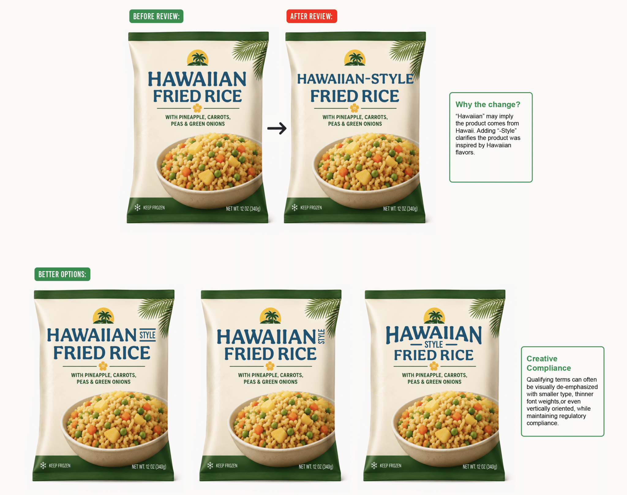
“Qualifiers” are terms like “flavored,” “style,” “imitation,” or “inspired” that are often legally required to be included in the product name depending on the formulation or where the product is made.
For example, “Hawaiian Fried Rice” may need to become “Hawaiian-Style Fried Rice” if the product isn’t actually from Hawaii. Or “Vanilla Ice Cream” must change to “Vanilla-Flavored Ice Cream” if it doesn’t have enough real vanilla in the recipe.
Callouts and claims may also need qualifiers. For example, “No Nitrates” may need to be accompanied by the qualifier “except those naturally occurring in sea salt or celery powder.”
These extra words add clutter and shift attention away from what you want the consumer to focus on. The good news is these qualifying terms can often be visually de-emphasized with smaller type, thinner font weights, lighter colors, or even vertically oriented, while maintaining regulatory compliance.
Nutrition Facts and Barcodes
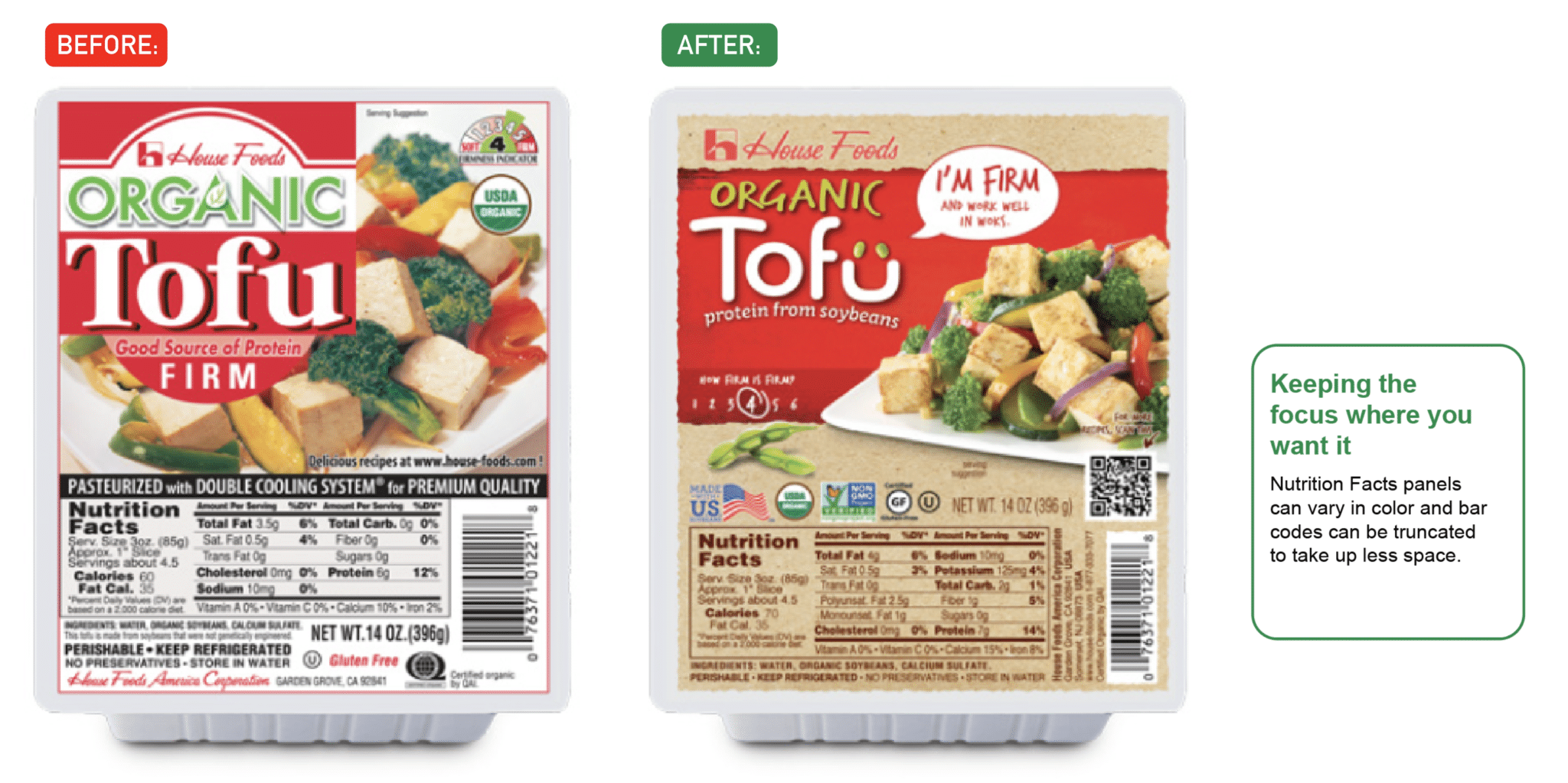
Many people assume Nutrition Facts panels must appear as harsh black-and-white boxes that visually compete with the rest of the design. While Nutrition Facts panels have many formatting requirements, being strictly black and white is not one of them. They do require sufficient contrast for readability, but thoughtful color selection can help them integrate more seamlessly into the overall packaging design.
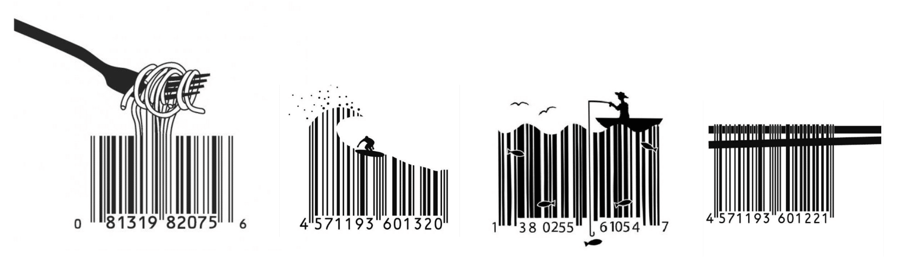
Barcodes also offer more flexibility than many realize. They can appear in colors other than black and may be rotated or truncated in height to create more room for other design elements.
One important note: if you modify a barcode, always make sure it still scans properly. Your regulatory expert may not be reviewing barcode functionality, so it’s important to verify scannability before going to print. There are many barcode scanner apps available for smartphones to help you test it yourself, and your printer can do one last check before printing.
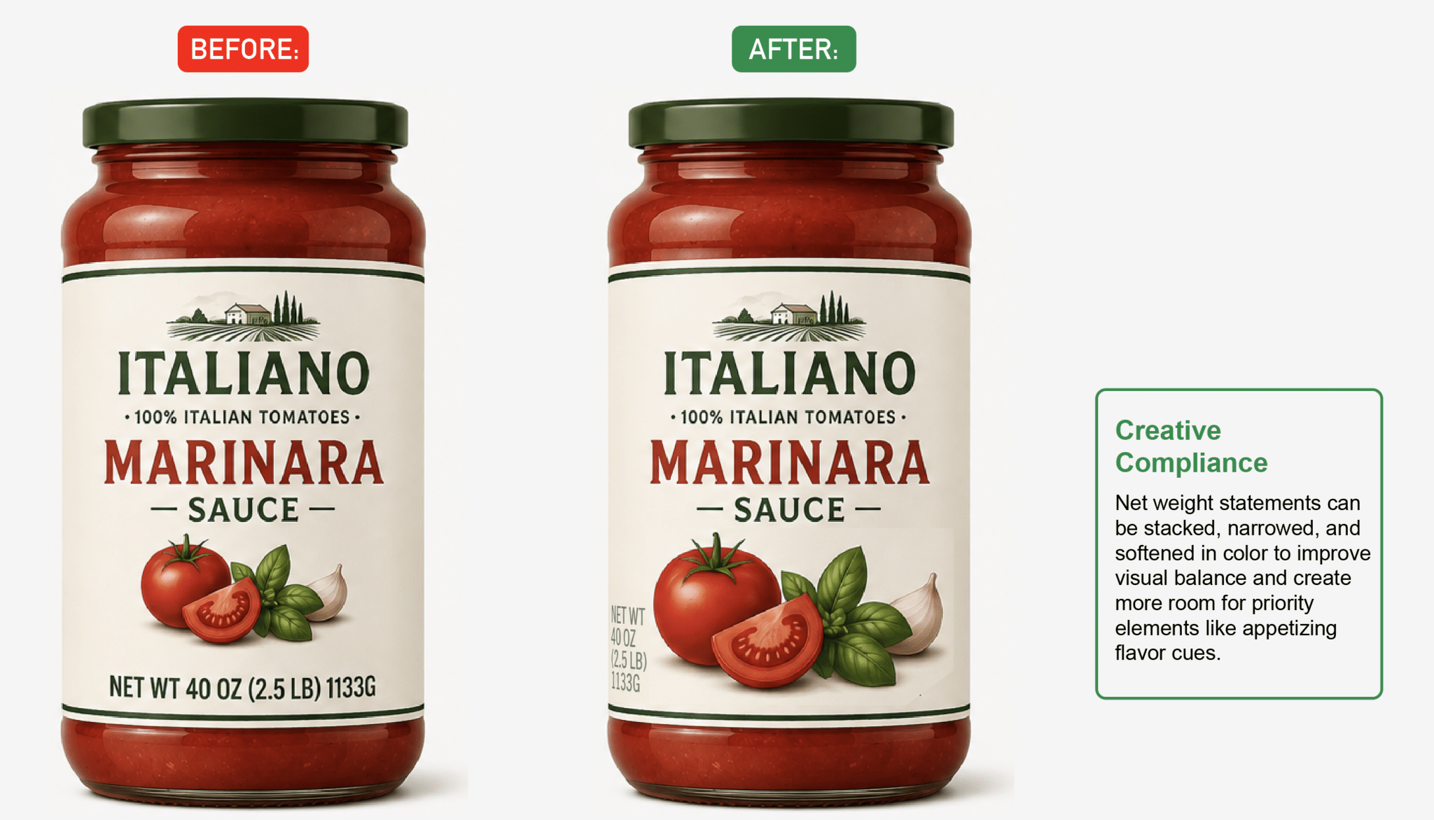
Net weight statements
Net weight statements have strict height standards based on your label dimensions (here’s our handy cheat sheet), but small tweaks can improve visual balance without compromising compliance.
Stacked formatting, narrower font treatments, and more subdued colors can help reduce visual dominance while maintaining readability and creating more room for flavor cues or other priority design elements.
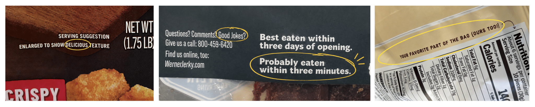
Pro tip: bring personality to your technical copy.
Technical information and regulatory elements do not have to feel separate from the brand experience. In fact, some of the most memorable brand moments happen in the “functional” areas precisely because they’re unexpected.
Elements like disclaimers, callouts, inspection seals, side panels, legal copy blocks, and enlarged-to-show messaging can all become opportunities to reinforce brand voice, add humor, guide the eye, or create a more engaging consumer experience.
As we like to say, the delight is in the details.
There’s even room to inject personality into barcodes…
Where do I find a compliance review expert?
If your creative agency doesn’t offer compliance reviews internally, they should be able to connect you with a qualified regulatory expert.
There are also many online resources that can help navigate packaging regulations. But if you’re dealing with compliance for the first time, don’t wait until the final round of revisions to start the conversation.
And remember: your package isn’t the only thing that needs to be compliant. Websites, sales sheets, retailer decks, and even social media posts can all be considered “labeling” in the FDA’s eyes.
Disclaimer:
Packaging regulations are constantly evolving, and requirements can vary depending on your product, claims, ingredients, and distribution channels. This article is intended to illustrate common packaging compliance scenarios and does not provide legal advice, nor should it replace a formal regulatory review. Always work with a qualified regulatory expert to review your packaging, claims, and marketing materials before printing or launching.
———————————
Carrie Dufour is the founder of Truly Creative, a brand development and design studio specializing in food, beverage, and wellness. After years spent exploring global cuisines and cultures, she now helps brands navigate strategy, packaging, and compliance while creating work that feels human, approachable, and cart-worthy.
Education Articles