- Marketing
Don’t Launch With This Label: 5 Packaging Mistakes Killing Sales
By:

“Is my packaging actually working?”
It’s one of the most common—and most nerve-wracking—questions founders ask themselves after launching. You’ve poured energy into product development, sourced better ingredients, crafted the perfect formulation… but somehow, your product just isn’t moving off the shelf.
Here’s the hard truth: if your packaging doesn’t convert, your product never gets the chance to.
Emotional vs. Logical Design: Why Most Founders Miss the Mark
Your design must operate on two levels of thinking.
🧠 System 1 – Emotional:
This is your customer’s gut reaction—fast, automatic, and intuitive. Think bold colors, drool-worthy visuals, and immediate shelf impact. It grabs attention in a split second.
🧠 System 2 – Logical:
Once you’ve caught their eye, this part of the brain kicks in to rationalize the purchase. It needs clear value props like “15g protein,” “no added sugar,” or “organic.” This is where trust is built.
If your packaging appeals to only one side, you’re leaving sales on the table. Without emotional impact, no one notices. Without logical clarity, no one commits.
🔑 Remember: Visual Design pulls them in. Logic drives buyability.
Let’s break down the five biggest packaging mistakes that are quietly killing your velocity—and what to do instead.
1. Busy Front of Pack = Reduced Visibility & Flow
When everything is shouting, nothing is heard. A cluttered front panel is one of the fastest ways to lose a customer’s attention. Founders often try to cram every value prop, claim, photo, and pattern into one tiny space—but this overload kills flow.
Symptoms:
- Multiple font weights and styles jammed together
- Claims randomly scattered without a clear visual hierarchy
- Logo, photography, and icons all fighting for dominance
- Empty emotional taglines (e.g. “feel better”) without context
- No visual breaks—backgrounds are either flat or chaotic
Strategic Fallout:
- Consumers get confused and pause—slowing the buying decision
- Your differentiation isn’t immediately visible
- Retail buyers can’t easily identify your edge
Fix it:
- Use layout hierarchy to guide the eye from top to bottom
- Prioritize 1–2 front-facing claims that matter most to your category
- Embrace white space to give your message breathing room
- Design each panel with intention, not as a dumping ground
✍️ Pro Tip: Take a photo of your front panel and shrink it to a 1-inch thumbnail. If it’s not legible at a glance, it’s not working on the shelf.
2. Forgetting Appetite Appeal = Killing the Crave
Humans eat with their eyes. And if your packaging doesn’t spark desire, your customer won’t pick it up—no matter how clean or functional the product is.
This is especially true in categories like snacks, beverages, and frozen foods, where impulse drives discovery.
Common Missteps:
- No food photography or product window
- Images that look flat, cold, or overly sterile
- Design feels clinical—missing cues of indulgence or freshness
- Visuals don’t match the sensory experience (e.g., dry graphics for a creamy product)
Impact:
- Low impulse pickup on-shelf or online
- Distrust in taste or quality—especially for premium-priced SKUs
Fix it:
- Use high-contrast, appetizing photography where possible
- If your packaging includes a window, show abundance and quality
- Align your visuals with your core promise: indulgent? vibrant. Fresh? crisp.
- Don’t shy away from emotional appetite triggers—even for functional products
📸 Example: Think of how Olipop uses creamy soda visuals to cue both nostalgia and crave, even with gut health benefits.
3. Burying the Value = Bleeding Conversion
Your customer shouldn’t need to hunt for your selling points. If your claims are hidden, buried in small print, or left to the back panel—you’re leaking conversion opportunities every time someone picks up your product.
Watch For:
- Functional benefits in tiny type or hard-to-read fonts
- Key claims relegated to the side or back panel
- Badges and callouts that visually blend into the background
Fix it:
- Identify 1–2 hero claims most relevant to your category
- Make them bold, official, and easy to spot—use badges or color blocks
- Give those claims breathing room with clean layout around them
- Test which claims resonate most with your target customer—don’t guess
🎯 Rule of Thumb: If a retail buyer or shopper can’t tell why your product matters in 3 seconds, you’re missing the mark.
4. Playing It Safe = Losing Brand Personality
If your packaging doesn’t express who you are, it’s easy to get lost. People buy brands, not just products—and that emotional connection starts with packaging.
Yet many brands play it safe, defaulting to sterile logos and templated layouts in an effort to look “clean” or “premium.”
Red Flags:
- Generic logos or neutral typefaces with no energy
- No emotion or attitude in packaging tone
- Over-reliance on “minimalist” design without brand soul
Fix it:
- Infuse your brand voice into packaging—through icons, copy, or typography
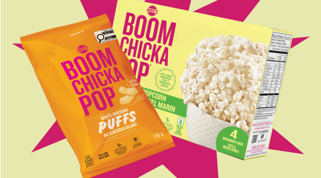
- Take inspiration from expressive brands like Graza or Bloom, which use tone and layout to connect
- Let your packaging reflect your consumer’s mindset—joyful, rebellious, focused, nurturing—whatever fits
✨ Stand for something. Even a simple slogan or unexpected color choice can make your brand memorable.
5. Illegible Packaging = Invisible Product
If your packaging can’t be read quickly, it may as well not exist. Between crowded shelves and fast mobile scrolls, your design must communicate fast, clear, and bold.
Look Out For:
- Small fonts on crowded or low-contrast backgrounds
- Decorative typefaces that are hard to scan
- Long narratives jammed into tiny real estate
- Light grey text on white or pastel—barely legible in store lighting
Fix it:
- Use the 3-Second / 3-Foot Rule: Can someone understand your product in 3 seconds from 3 feet away?
- Optimize your color contrast for visibility (not just aesthetics)
- Invest in a high-legibility type system—sans-serif fonts with bold weights
- Keep your back-of-pack story clear, concise, and punchy
🕶️ Reality Check: If your best friend’s mom can’t read your label without squinting, it’s time for a redesign.
Ready to Fix Your Packaging? Start With a Free Audit from EO Space
Your packaging has one job: get picked up and purchased. If it’s not doing that you’re losing momentum and shelf visibility.
The good news? You don’t have to figure it out alone.
EO Space is an agile F&B design studio helping growth-stage grocery brands create world-class brand, packaging, and marketing experiences for modern retailers and new-age consumers. Their team blends strategy and creativity to help you translate product value into shelf appeal—and drive real velocity.
Limited Offer:
Get a FREE Packaging Audit — see how your packaging stacks up against top grocery brands with expert feedback on your front-of-pack design, messaging, and retail readiness.


