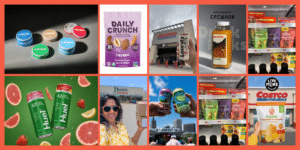
Improve Amazon Main Image CTR Through A/B Testing

by Foodbevy

January 4, 2024

How do you decide which main product image is more-likely to convert a viewer into a customer? Let’s find out. I worked with Mindful Goods to create the Joyful Co Amazon listings, including our photos. One of the things I love about Amazon is that they take a strong approach to conversion optimization on the product detail page… meaning, which combination of photos and text are most likely to get a person to click on a listing and convert to a customer.

Main Image Comparison

Amazon makes it easy to A/B test product images on the platform itself, but we wanted to get a since of how our potential images would perform before we made the listing live. I worked with Mindful Goods to A/B test 3 images using PickFu, a customer research platform. Here are the results:

Audience: 30 U.S.-based respondents, Amazon Prime subscribers

Research Question: Please rank the following images in order of their influence on your purchase decision and explain why.

One cool thing about PickFu is that they ask customers to write the reasons “why” behind their choices, and then creates an actionable summary written by AI:

“The winning option in this survey was Option A, which received the highest score of 53. Option A stood out for its ability to provide a comprehensive view of the product and its packaging. Respondents appreciated seeing the contents inside the box, as well as having a sense of size and scale with the inclusion of hands in the image. The personal touch conveyed by Option A, along with its organized presentation, gave it a more luxurious feel compared to the other options. Additionally, respondents noted that Option B had a similar appeal in terms of showcasing products unobstructed and offering an inside view, but it fell short due to the presence of a “gift” badge that was perceived as cheap-looking. Meanwhile, Option C received lower scores overall due to not fully capturing all components or providing an attractive and detailed display.”

Competitor Main Image Comparison

The Mindful Goods team also ran a comparison to see how we stand up agains our competition. Here are the results:

“In this survey, Option A emerged as the winning choice based on the ranked preferences of the respondents. Option A received the highest number of first-choice rankings (20 out of 30), indicating a clear preference among participants. The characteristics that set Option A apart from the other options were its colorful and attractive packaging, which caught attention and conveyed a sense of warmth and festivity. Additionally, respondents appreciated how the products were neatly arranged within the box, giving a professional and organized impression. These qualities made Option A stand out as a more appealing gift option compared to Options B and C.”

As next steps, I’ll be working with the Mindful Goods team to A/B test the product images on our live listing. I’m really excited to see how the results pan out and will be sharing those with you.

Mindful Goods also created the full image, A+ Content, and text listings for Joyful Co. Check one of them out here:

If you want help revamping your listings, Mindful Goods is offering 10% off their services to all Foodbevy readers. Just use coupon code FOODBEVY at checkout.

More From The Blog

This Week in CPG 05/13/24

This Week in CPG by Foodbevy 🛒 Retail Rollouts 🌻 Brian Waddick celebrates Smackin’ Sunflower Seeds going nationwide at Royal Farms, marking a significant retail expansion. Brian Waddick’s Smackin’ Sunflower

Read More »

Subscribe To The Foodbevy Newsletter

Be the first to get our latest news stories, interviews, and discounts. 

Restricted to Premium Members Only

Sign In

Not a Premium Member? Sign Up Here:

The online the community for food and beverage founders